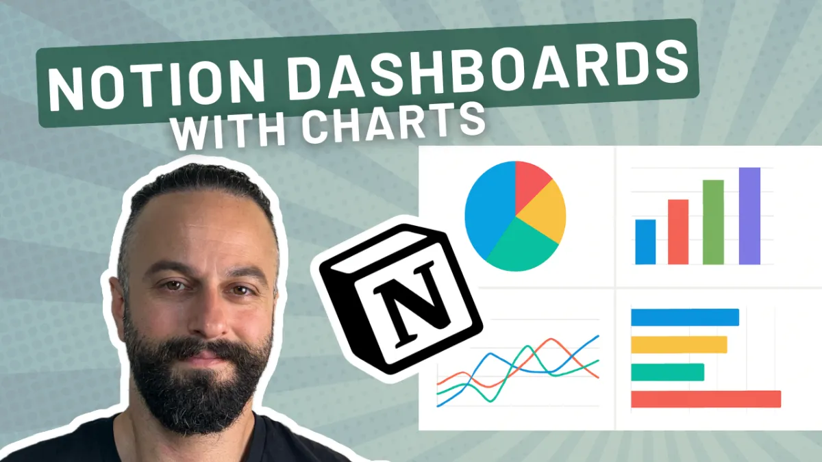
Create Stunning Notion Dashboards with Interactive Charts
Introduction to Notion Charts
Notion is already pretty beautiful, but let's take it to the next level by using Notion Charts to create gorgeous dashboards. If you've not made dashboards in notion before, then I'm gonna show you everything you need to know how to use Notion charts, a few examples of how you might wanna get started.
So whether you are implementing this in your personal workspace or in your business workspace, you can have everything you need to get started and to start visualizing your data and get access to that key information at a glance. So I've got three to walk you through, three examples, and as I walk through them, I'm gonna show you the functionality of notion charts and I'll throw in some bonus tips and tricks along the way so that you know everything by the end of this video to start installing them in your workspace.
So let's jump over to share screen and let's get started.
Overview of Dashboards
Okay, so three dashboards. We have a sales pipeline dashboard. We're gonna go through a content performance dashboard. This one's really interesting. Might be a way that you wanna track your YouTube metrics or your LinkedIn post performance, for example, and then a marketing ROI dashboard.
Sales Pipeline Dashboard
So let's jump into the first one and get going.
Now one of the core principles that I tend to use when I'm building dashboards is use as many of the notion views available to you as possible, and that makes sense, so that you can create interesting yet functional dashboards. So you see I'm leveraging a board here because that makes sense for a pipeline, a sales pipeline, right?
The items tend to move from left to right. In this case it's going the other way, but. The idea is to create relevant views for you. Then we want some nice use of charts to get snapshots. Highly recommend using these line charts for metrics like financials over time. And then at the bottom, you wanna always have just sort of like a raw table of the data that is powering all these views, so that if you wanna dig into one of these, it's a little bit easier to just see and go into the one that you wanna check out.
In terms of views, look, we have nine available to us now. Tables, boards, timelines, calendars, lists, galleries, charts, feeds, and our maps. Maps are really cool. I don't suspect we would have a use for them in a sales pipeline dashboard. Maybe we might wanna say, okay, where are our prospects coming from?
So yeah, just use anything that makes sense to you. So you can see here we've got, obviously the, the top bid is the pipeline by stage, revenue by stage we can get a quick. Glance of the revenue at each of those stages where those deals are being sourced from, we can start to forecast in here. So these are great tools to either use if you are a solopreneur or if you are the head of the business, or if it's a bigger organization, you can create these for leadership and they just wanna see the essentials at a glance, right?
So you can create maybe a suite of dashboards that they can go into. That's gonna enable them to sort of self-serve and not have to come and ask people for, for data. They can just go and check it out themselves.
Content Performance Dashboard
Let's check out the content performance dashboard. You can see here I'm playing with columns to create different layouts, so I'm just using a one column layout here to, to maximize the width.
Again, it depends on what you're building on a case by case basis, but I wanna see a long horizontal view of my views over time. And then a nice quick glance at the top performers. In a content context, this is really helpful 'cause it enables me to see, okay, what are my high performing videos and what are the ones that I might want to create a follow up video because I'm, I've already tested this against the market.
What are the ones that I might want to repurpose into YouTube shorts or blog posts, et cetera. Now you might be thinking, Tony, how do I even get these metrics into notion? That's a good question. So natively this is not available. You, you could create an argument for building an agent, an AI agent to do this for you, but I think that's quite laborious.
So what I would do instead is enable this with an external automation like make.com or Zapier. These kind of integrations are a hundred percent possible. And yeah, you could just have an external automation that hooks into the API of your platform. So say you wanna track your YouTube metrics and basically that integration would feed your charts.
So this is a bit more of an advanced use case that isn't available natively in Notion but you can definitely build it. That's the flexibility and power of the platform. So you can see, again, I'm, I'm just using relevant visualizations that make sense to me. And then at the bottom, I always like to keep a
raw table view. So you can just see every, this is the data that powers everything that I'm seeing. I can get quick access to specific items and, dig in a little bit deeper if I need to.
Marketing ROI Dashboard
Let's look at the marketing ROI dashboard. You see here, this is two columns. So again, these are sort of related items. We've got revenue by channel and then the ROI by channel. So I can see at a glance what my return on investment is looking like.
Advanced Tips and Tricks
Now let me start showing you a couple of interesting things.
So, what I do for a really clean look is by default, every time you create a view you have this sort of like extra UI fluff. You know, it's useful if you wanna add new data, but if you're just building a dashboard for the purposes of viewing it, then I don't really see the point in having this new here.
And all these filters that are kind of clogging up the ui. So. Notion of recently added this nice little minimize button. So I recommend just minimizing this so it makes it clear that it's a view-only interface and it just tidies everything up and helps you to focus on the actual data itself. One cool thing is you can click on
one of these pills and go into edit view. And there's loads of options here to play around with, right? So you can go wild and start building anything you want here. So you can build vertical bars, horizontal bars, line charts and donuts, which you've already seen examples of. But yeah, it gets pretty detailed.
So you can go as much into the weeds as you want. They've recently added this reference line, which is really cool. So you can start to see like a, a reference line between specific points in your charts, if that is something that would be helpful to you. You can do interesting and useful things like emitting zero values.
You can create cumulative graphs over time if you wanna see how things are accumulating and not just necessarily how things are stacking up on a month by month basis. For example you can set colors. And then this, this more styles option gives you loads of styling options. So you can set the height of the chart you can play with labels, create your own captions all sorts.
And then again, just apply your own filters, right? One cool thing as well is this selection right here, this option save chart as if you click this, you can actually export these charts. So if you need to. Have an actual sort of physical copy, so to speak, to present in a slide deck or something like that.
You can just actually pull them out of notion in any form of that that you want. Add a nice little background if that tickles you fancy. And yeah, that's a kind of underappreciated and not very well known feature. So I wanted to highlight that. Yeah, in general, I would say using charts is.
It's a great use case for Notion ai. So if you have Notion ai get it to work for you, get it to become your reporting assistant. So if you've got your data well structured in the databases then you can just literally query your AI and say, Hey, how are my metrics doing this week?
And then that can even save you a bit more time and just make the experience of digesting the information from your charts that bit easier if you can just open up a little chat helper and, and query it and have a little chat conversation instead of just visualizing it all the time.
So there are, they're the main things I wanted to go through, like how to clean this up, how to export it.
Creating Custom Formulas
Another cool tip is if you wanting to create formulas. So let's say I'm creating a formula. Let's just do something really random. Like let's create a formula to double this spend property right here.
So we'll call it double spend. We'll create a formula and we are gonna do multiply. Gonna get this spend and multiply it by two. Okay? The cool thing is with charts, you can also pull in this formula. So if I were to try to modify or just show you in the settings here what to show, I should now be able to see double spend.
So that's really handy. 'cause you can start to create really interesting and customized metrics using formulas. Obviously this can get way more complex. But a tip is if your formula is not showing in those dropdown options of the chart, then just make sure that you go to the edit property of your formula and make sure that it's outputting in the data type that you want.
That's just a little, very nuanced trick if you ever run into any roadblocks there. So, as you can see, this is my general pattern. I like to build dashboards that have all that key data up front, relevant data positioned together using two columns so it makes it easier to reason and visualize.
And then at the bottom, always a reference table of the data that powers the whole thing.
Conclusion
All right, so that was three examples, guys. Sales pipeline, content performance dashboard, and a marketing ROI dashboard. Hope that was useful. I'll just note that the metrics that you are going to visualize are really dependent on the quality of your data architecture, the quality of your databases essentially.
So you know, if you're looking for somebody to help you out with architecture, with system design, with workflow design, then feel free to get in touch. We specialize in working with businesses that use notion or that want to migrate into notion, and we can build you incredible dashboards like these in no time at all.
So. Yeah, check us out in the description below. Book a call and we'll jump on a free call with you. Just have a little consultation and figure out where you're at in your business and see if notion and we as a service provider can help you out. Alright, so that's it for this week guys. Thanks for tuning in.
I'll see you in the next one. Bye.
